Plotting in R
Inflation vs Unemployment
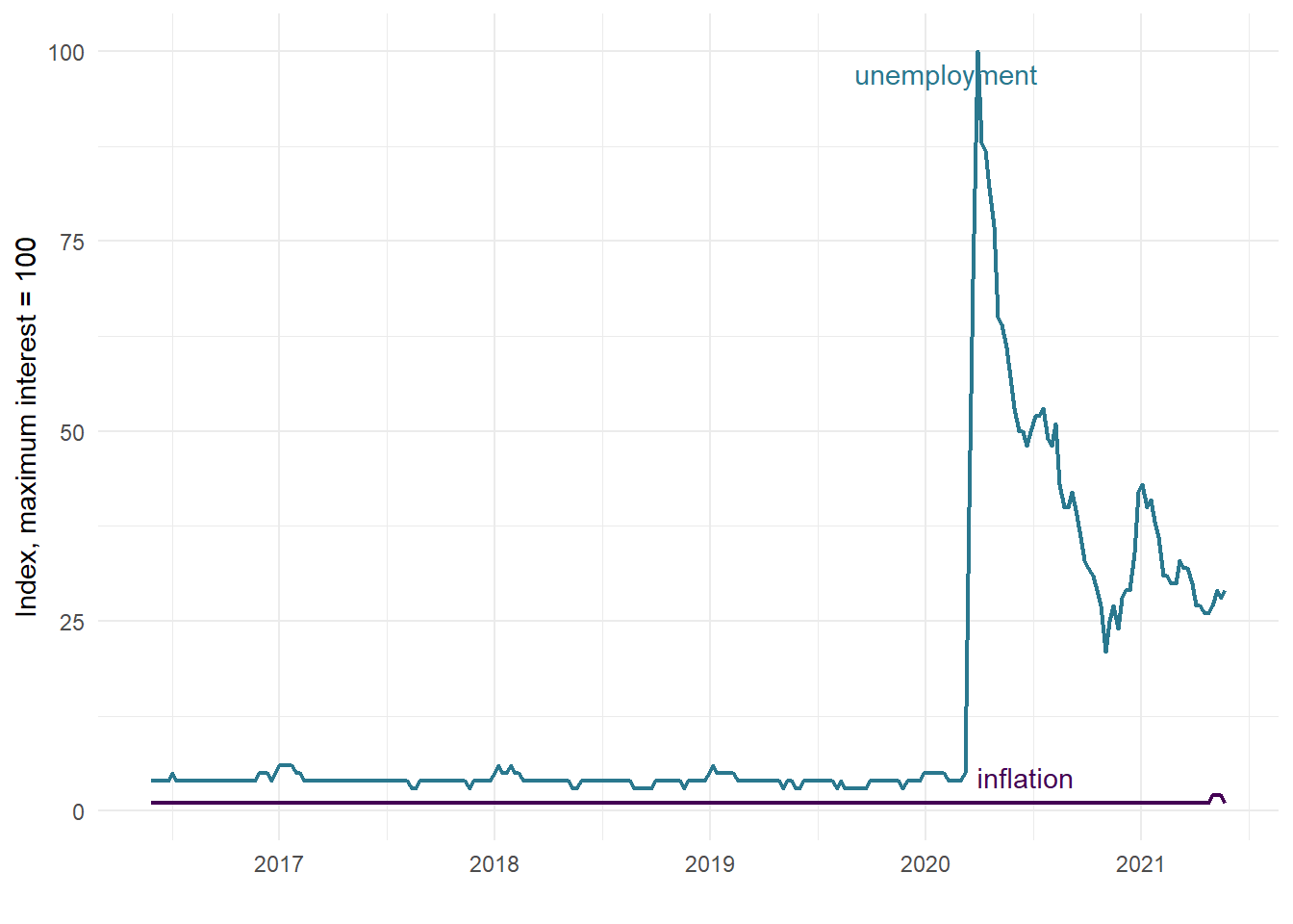
Do people care more about inflation or unemployment? Here’s R code to reproduce a plot featured by Professor Justin Wolfers in this tweet.
library(ggplot2)
library(gtrendsR)
library(ggrepel)
library(tidyverse)
library(lubridate)
dat <- gtrends(c("inflation", "unemployment"), geo = c("US"))
interest <- as_tibble(dat$interest_over_time)

interest <- interest %>%
  rename(date_time = date) %>%
  mutate(date = as_date(date_time, tz = NULL),
         my_label = case_when(
    date == ymd("2020-03-29") ~ keyword,
    TRUE ~ ""
  ))

ggplot(data = interest) +
  geom_line(mapping = aes(x = date, y = hits, color = keyword),
            size = 0.8) +
  geom_text_repel(mapping = aes(x = date, y = hits,
                                label = my_label, color = keyword),
                  max.overlaps = 100) +
  labs(x = "", y = "Index, maximum interest = 100") +
  scale_color_ordinal(end = 0.4) +
  theme_minimal() +
  guides(color = FALSE)
 As Professor Wolfers put it:
“But by jingo, there’s a lot more interest in unemployment than inflation.”